Edward Tufte’s Presenting Data and Information course recap
Edward Tufte opens his one-day course with the Music Animation Machine by Stephen Malinowski. In near total darkness, backlit by Chopin’s Berceuse, Op. 57 rendered in scrolling neon lights, leaning over the concentrated beam of a desk lamp, Tufte sets the stage for his five-hour study of the presentation of information.
The blend of expectation and surprise, the integration of the auditory and the visual orchestrated in time, the Music Animation Machine serves as the prologue for Tufte’s survey of his four books covering the principles of design, data presentation, and (perhaps not as well advertised) the precision of language he so evidently wants to impart to attendees.
Tufte’s talk revealed his tenacious commitment to truth, transparency, pragmatism, and open-source technologies. He delivered his lecture with a no-bullshit attitude and surprising (to me, at least) humor.
Among designers, Tufte is treasured, but perhaps his profile isn’t quite as high among content strategists. It should be, as his is an approach that elevates content above all other concerns, as he confirmed early in his talk: “Every move should be about the content.” He returned to the primacy of content throughout the lecture.
Here are some of my favorite ideas and quotes from the talk:
-
“Adjacent in space” is preferable to “stacked in time”.
Adjacency in space is a concept Tufte returned to throughout the talk. I can’t do it justice here, but it refers to the integration (co-location) of related data variants and elements (preferably under the audience’s control to explore) versus the presentation of data in a slide deck. In the latter, the audience is presented partial information at any given time, usually at the pace and discretion of a presenter. -
“Do not visualize ‘little data’.”
Basically, people overuse charts. Sometimes text is the best way to visualize information.
Speaking of… -
The resolution of typography is much higher than that of a visualization.
I was in the back of the room for the course, so the audio wasn’t great, but it sounded like Tufte said the resolution of typography is 50 times that of a visualization. I’ll try to confirm that number, but the resolution of typography is certainly high, which is why designing with words is often the best approach for “little data”. -
“Sparklines are datawords: data-intense, design-simple, word-sized graphics.”
Tufte’s focus on the efficacy and simplicity of sparklines was one of my favorite segments of the lecture. There are so many applications for these beautifully unadorned mini-charts, which function – at least in terms of resolution – as “plugins” for language, similar to plugins for software. That is, they make language more extensible; they enhance language, without departing from it’s unique characteristics, form, and value.
☝️ I should probably point out at this juncture that Tufte encouraged us to mark up his books (I assume in the form of underlining and highlighting) rather than try to interpret, rephrase, and redraft his ideas into notes. So, grain of salt?
-
On account of a study related to memory retention, some designers became obsessed with limiting the number of ideas presented on a website at any one time. But the task isn’t memorization; it’s scanning.
-
“Scroll bars are content vampires.”
-
“The major innovation isn’t software; it’s the resolution of hardware.”
-
“Open mind, not empty head”
-
“If it can’t go on like this, it won’t.”
-
“Every forecast is a pitch.”
-
“Show up early and finish early.”
-
If you do it right, “even the higher-ups will understand.”
-
Respect your audience; don’t dumb it down; you’re there to make everyone smarter.
-
Many people think a larger amount of information can be a barrier to understanding, but there isn’t a relationship between the amount of information and understanding (Google maps presents a massive amount of information, but people use it effectively everyday).
-
“Social science isn’t rocket science; it’s harder.”
-
“Everything you do should be focused on the content.”
Edward Tufte on tour
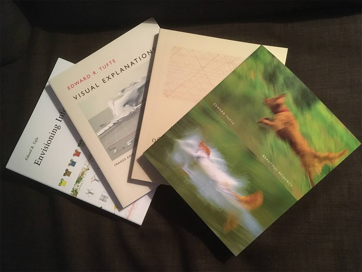
Go to Edward Tufte’s course, if you can; it’s certainly worth it (in addition to the knowledge bombs, you receive all four of his books as part of the course fee).
Tufte is on the road between July and December, traveling to Denver, Minneapolis, Chicago, Boston, Philadelphia, Brooklyn, San Francisco, and San Jose.